The
New York Times
The New York Who?
The Times marketing group had a fundamental problem. It didn’t know who it was, or what the Times was, is, and could be. As such, it didn’t know how to present The Times to its readers and potential subscribers. Existing marketing materials generally involved slapping a sale price on a random press photo and calling it a day.
Campaign by campaign, we carved out a series of design strategies and tactics that allowed us to be consistent across campaigns and as multi-faceted as the paper itself has become over time — a source of serious, truthful, breaking news and reporting, and also a place to find debate, criticism and insight on culture, style, arts and entertainment and so much more. We developed a range of ways to picture a Times at turns insightful, entertaining, solemn when needed, ebullient often. We established a sensibility at one with the urbanity, clarity and wit readers experience when immersing themselves in everything that The Times has to offer.
In This Section
Times Insider
Apple Watch
Holiday
Men’s Style
All Access
March Madness
Labor Day
Give the Times
Holiday 2
Work
Campaign
Brand Identity
Print
Digital
Times Insider
Welcome to the Newsroom
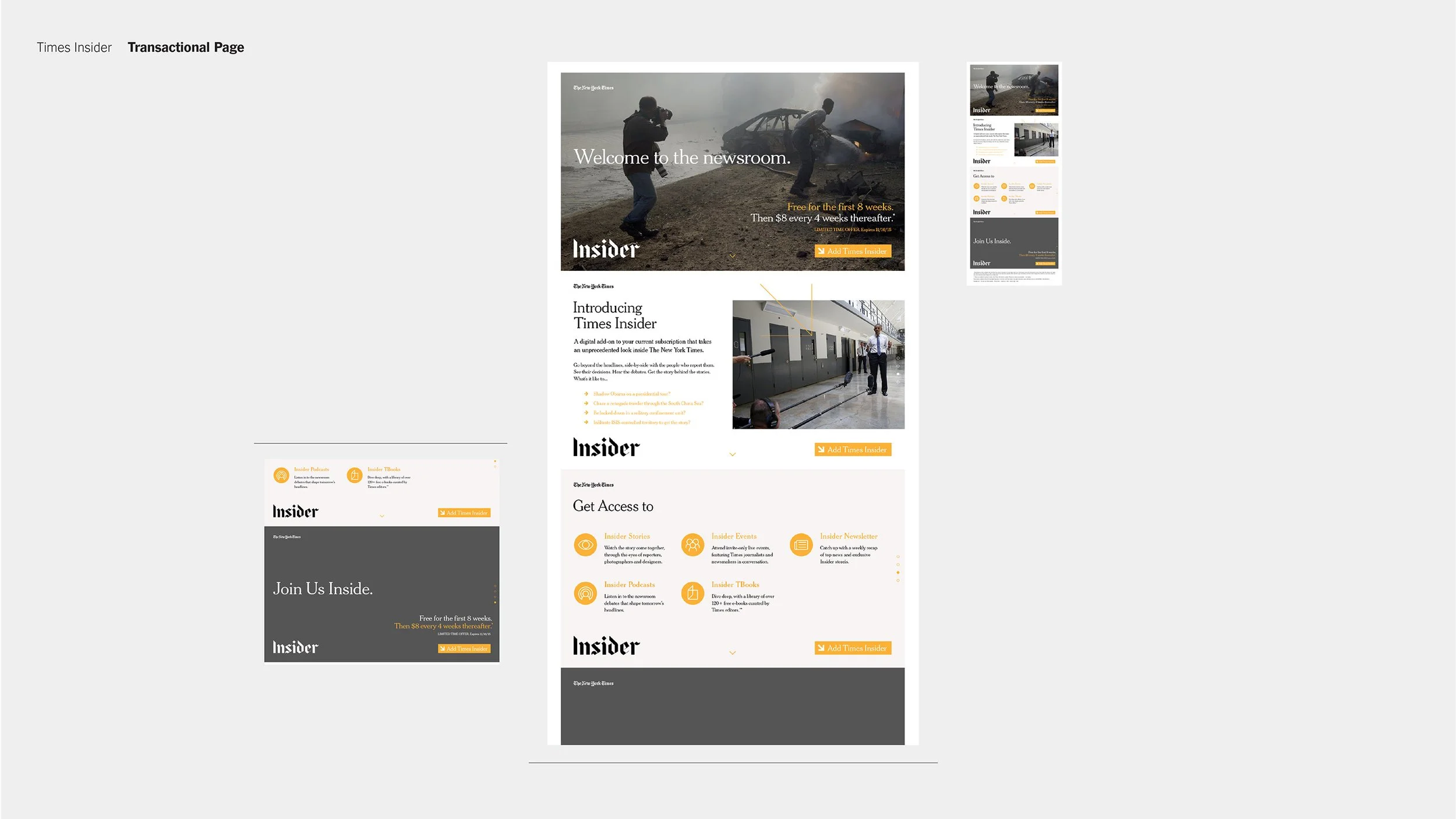
Times Insider is a by-subscription offering that delivers behind-the-scenes insights into how news, features and opinion come together at The New York Times. An all-access pass to the stories behind the stories and the journalists who make them, Times Insider gives members an exclusive invitation to live discussions and panels, podcasts, riveting first-person accounts and even a look into the pages of reporters notebooks.
The Insider work was the perfect place to use imagery depicting the hard news and global reach that’s at the newspaper’s core, and to emulate the look of the paper itself.
Art Directors
Alex Ku
Max Pfennighaus
Design
Alex Ku
Maria Cusack
Work
Marketing
Brand
Print
Digital
Times
App
T Time
Working on these minimalist ads for the Times App for Apple Watch made me understand that this under-utilized, drop-dead gorgeous Gothic T could be harnessed as a logo in our campaigns, unleashing its instant, symbolic legibility and swashy charisma.
Art Director
& Design Lead
Alex Ku
Design
Alex Ku
Work
Marketing
Brand
Print
Digital
Holiday
To a T
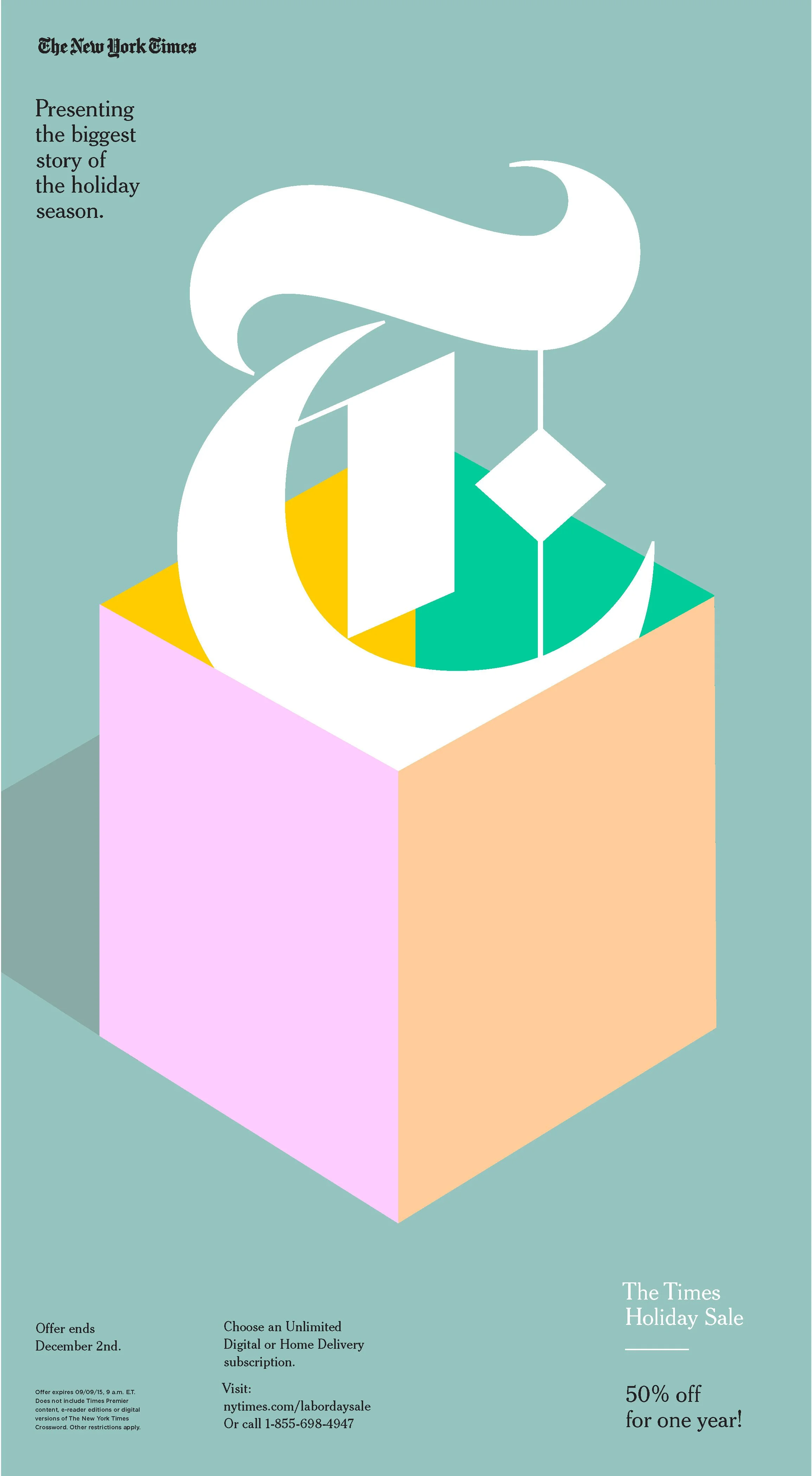
We used the Times Gothic T as a pictographic logo in this simple, pleasantly surreal set of Holiday Ads. The T’s stylish, expressive strokes contrast beautifully with the pared down, superflat illustration style we were developing for this and other upcoming campaigns.
Art Director
Design Lead
and
Illustrator
Alex Ku
Work
Marketing
Brand
Print
Digital
Digital
Alternate colorways
Men’s Style
Suit Yourself
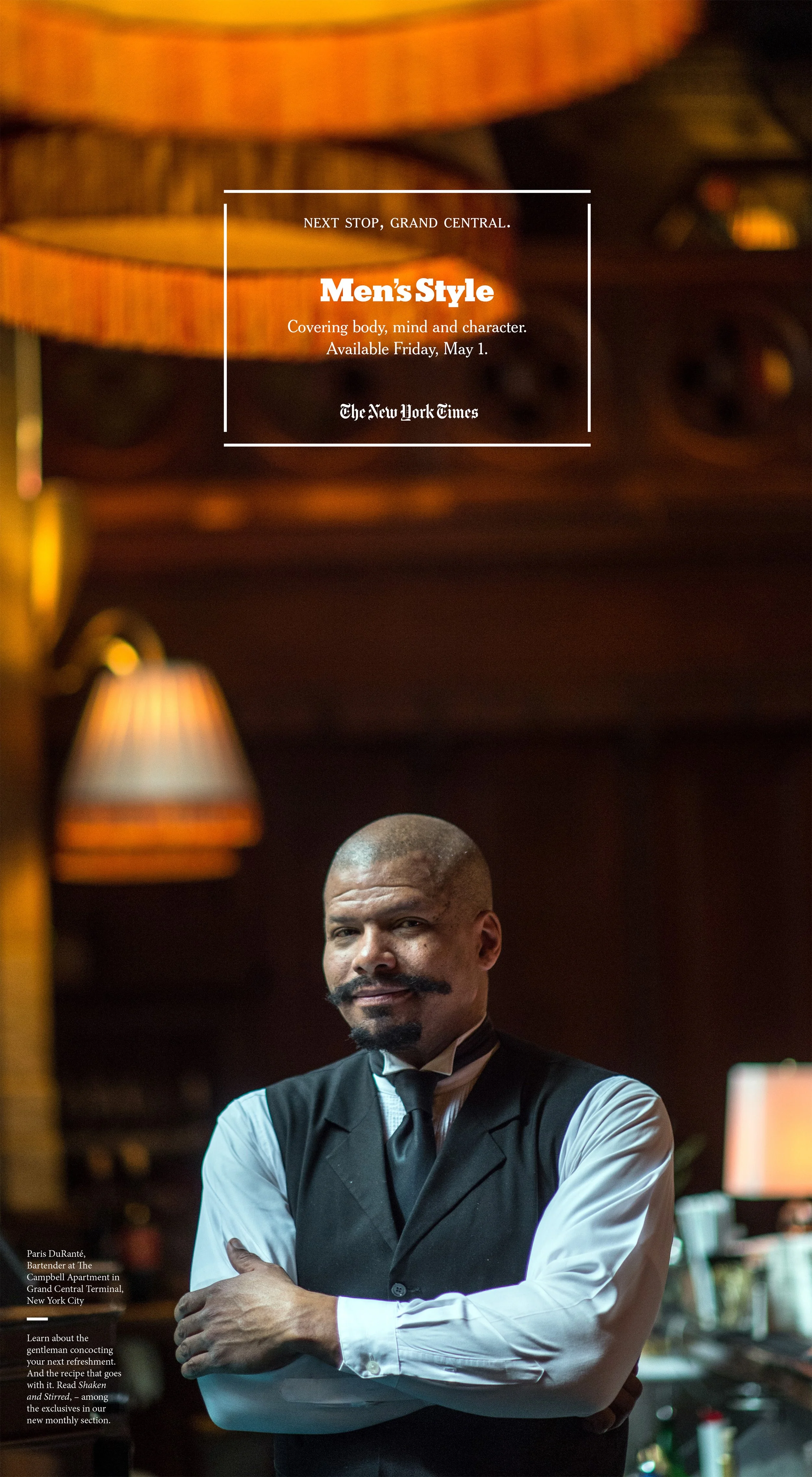
When The Times launched Men’s Style, a new section that appears intermittently in the print and digital editions of the paper, we heralded its arrival and subsequent appearances with full page ads, pairing thrilling and unusual imagery with pithy, evocative one- liners. Suit yourself!
Art Director
& Design Lead
Alex Ku
Design
Alex Ku
Maria Cusack
Writer
Nat Whitten
Work
Marketing
Brand
Print
Digital
Men’s Style
1. Next stop, Grand Central.
2. Business. Casual.
3. From street to runway.
4. Fetching looks for Summer.
5. Conservative meet Liberal.
6. Mixed Media.
7. Look Smart. Or die Tryin. 1.
8. Look Smart. Or Die Tryin. 2.
9. Michael Stipe’s Latest Ensemble.
10. Look Smart. Or Die Tryin. 3.
11. Suit Yourself.
12. What makes John Mayer tick?
1.
Next stop, Grand Central.
2.
Business. Casual.
7.
Look Smart. Or
die tryin. I
6.
Mixed Media.
4.
Fetching looks for Summer.
3.
From street to runway.
5.
Conservative meet Liberal.
8.
Look smart. Or
die tryin. II
9.
Michael Stipe’s
latest ensemble.
10.
Look Smart. Or
die tryin. III
11.
Suit yourself.
12.
What makes John Mayer tick?
March Madness
In the Paint
Building on the super flat style I started using for Holiday. These graphics take their cue from the lines of the court and the basketball itself.
Art Director
& Design Lead
Alex Ku
Design
Alex Ku
Work
Marketing
Brand
Digital
All Access
Weekend
TGI Fri / Sat / Sun
This alternate marketing approach gave readers unlimited access to everything for the weekend. The graphic solution is meant to have a blue skies, carefree feeling, the abbeviated days a bit like drifting clouds.
Art Director
& Design Lead
Alex Ku
Design
Alex Ku
Work
Marketing
Brand
Digital
Labor
Day
Labor of Love
For Labor Day we were able to commission this lovely collection of disparate characters with illustrator Matt Chase, The headline suggests that all kinds of things are afoot at this time of year, which made me think of the end of Fellini’s La Dolce Vita, with its processional of odd, costumed characters marching through the grounds of an old mansion, and then later through a sparse woods to the beach at daybreak. And then of course there’s the Labor day Parade, obviously.
The illustration of marching figures also make for a versatile image; they can be re-cropped, broken into smaller groups, and rearranged to fit the diverse range of digital formats that are required for social.
Illustrator
Matt Chase
Art Director
& Design Lead
Alex Ku
Design
Alex Ku
Work
Marketing
Brand
Digital
Give The
Times
Give
This campaign took The Times’s somewhat disparaging nickname, The Grey Lady, and turned it on its head, using an all-type solution reminiscent of headline copy and newsprint. We started with grey. and then expanded to make multiple kindred colorways, each one for a different thematic section of the paper. I came up with the phrasing for this one, using the rhetorical device of repetition to aid our animations.
Art Director
& Design Lead
Alex Ku
Design and Copy
Alex Ku
Work
Marketing
Brand
Digital
Holiday (2)
Glide, Dream, Explore, Bestow
These luminous illustrations by Mike Lemanski are perfect holiday images, their translucent colors like stained glass. The set of objects operates kind of in reverse; instead of being pictographic symbols to speed meaning along, these juxtapositions of words and pictures are more associative and whimsical, giving off a quiet magic, a reflective tone that feels like holiday time. I was thinking of Magritte’s Interpretation of dreams paintings here, which pair objects and words evocatively, making new meanings as they meet.
Art Director
& Design Lead
Alex Ku
Design
Alex Ku
Illustrator
Mike Lemanski
Work
Marketing
Brand
Digital
3 Act Email
We employed a marketing device here based on data that people revisit email offers to mull them over. We made a set of three time-lapse like emails, showing a canine holiday feast in progress.


